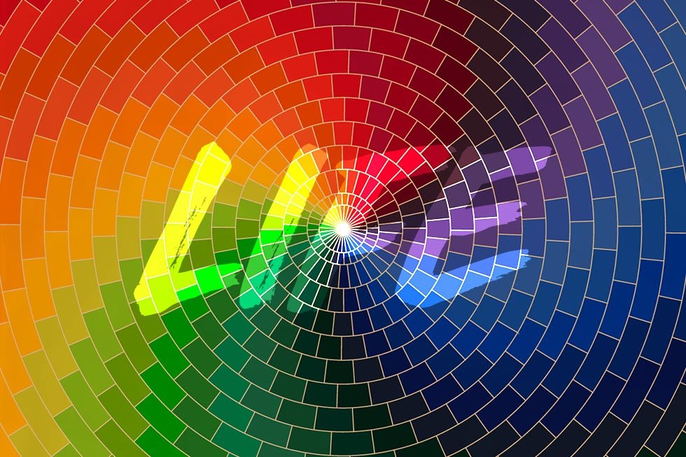
Colour is more than just a visual sensation; it is a powerful tool that influences our emotions, perceptions, and behaviours. In the realm of marketing and branding, understanding colour psychology can make or break a campaign. From sparking interest to driving purchasing decisions, the right hues can significantly impact consumer perceptions and brand identity. Colours have the power to evoke specific emotions and associations, often rooted in cultural and personal experiences. Warm hues like red and orange are known to evoke feelings of excitement and passion, making them ideal for capturing attention and sparking interest. In contrast, cool tones like blue and green convey calmness and trust, fostering a sense of reliability and stability. Moreover, different hues can influence consumer behaviour in subtle yet significant ways. For instance, research suggests that red can stimulate appetite and impulse buying, while blue promotes trust and fosters brand loyalty. By harnessing the emotional impact of colour, businesses can create compelling brand experiences and forge deeper connections with their target audience. Let’s delve into the fascinating world of colour psychology and explore how businesses can leverage the right hues to captivate their audience and strengthen their brand presence.
Using Colour in Marketing:
Branding: The strategic use of colour can help businesses establish a distinct brand identity and evoke desired emotions in consumers. For example, Coca-Cola’s iconic red logo exudes energy and excitement, aligning with its dynamic brand image.
- Product Packaging: Colourful packaging can grab attention on crowded shelves and convey product attributes. Bright, vibrant hues may suggest freshness and vitality, while muted tones can evoke sophistication and luxury.
- Advertising: From digital ads to print media, colour plays a crucial role in capturing attention and conveying brand messages. Advertisers often use contrasting colours to create visual impact and draw viewers’ eyes to key elements.
Case Studies
McDonald’s:
The fast-food giant’s use of bright yellow and red hues in its branding
and signage reflects its energetic and inviting brand personality, enticing
customers to stop by for a quick bite.
Hypothetical Alternative: Subdued green and brown
Perception: Transitioning to subdued green and brown could evoke associations with health and natural ingredients, but it might not align with McDonald’s brand identity as a convenient and indulgent dining option. This change could confuse consumers and diminish the brand’s visibility.
Tiffany & Co.:
Known for its iconic Tiffany Blue packaging, the luxury jewellery brand conveys
elegance, sophistication, and exclusivity, reinforcing its premium brand positioning.
Starbucks:
Starbucks utilises a calming green colour scheme in its logo and branding to evoke feelings of relaxation, balance, and harmony. This choice reflects the brand’s commitment to providing a cosy and inviting atmosphere for its customers to enjoy their coffee experience. The use of green also aligns with Starbucks’ emphasis on sustainability and environmental responsibility, further enhancing its brand image.
Apple:
Apple’s minimalist and sleek branding predominantly features white and silver colours, symbolising simplicity, modernity, and innovation. The use of white conveys a sense of purity and cleanliness, reflecting the company’s commitment to excellence and cutting-edge technology. Additionally, silver accents add a touch of sophistication and luxury, positioning Apple products as premium and desirable items.
Hypothetical Alternative: Playful rainbow colours
Perception: Introducing playful rainbow colours could convey a sense of creativity and diversity, but it may not resonate with Apple’s target audience or convey the brand’s focus on cutting-edge technology and premium design. This change could dilute Apple’s brand identity and undermine its reputation for sleek and elegant products.
Conclusion:
In the competitive landscape of marketing and branding, colour psychology serves as a potent tool for businesses seeking to stand out and forge meaningful connections with consumers. By harnessing the emotional power of hues and employing strategic colour choices across branding, packaging, and advertising, companies can create compelling brand experiences that leave a lasting impression on their target audience.
Contact us now to explore how we can unlock the potential of hues in your marketing and branding efforts!
